Skip to content

Reality check
Teams need one visual voice across product, website, email, docs, and ads. Timelines are tight. Commissioned artwork for every screen rarely fits the calendar. Random images look disconnected and dilute trust. Ouch solves this with style based artwork that behaves like a reusable language. Choose a style, assemble a small kit, set two pages of rules, and ship screens that read as one product.
Library anatomy
Ouch is a catalog of vectors and high resolution rasters organized into coherent styles. Inside any style the characters, props, and backgrounds share proportions, line weight, spacing, and palette logic. That lets you recombine parts without visible seams. The catalog covers hero scenes for landing pages, mid sized scenes for explainers and blog posts, small spots for empty and error states, and subtle backdrops that pad layouts without stealing attention. Exports are available as SVG for control and PNG for channels that prefer raster. Both formats are large enough for dense displays.
What this replaces
Mood boards and scattered stock images create churn. A consistent style family becomes a small system that you can adopt in a day and extend across quarters. You keep one tone from homepage to onboarding to help articles. Design review focuses on message and flow rather than debating pictures.
Where it lives in your system
Treat the selected style as a subsystem next to typography, color tokens, icons, and grid. Give it a permanent home and write a short usage note so decisions repeat without meetings.
/brand/visuals/
/ouch-style-01/
README.md
tokens.json
hero/
scenes/
spots/
backgrounds/
The README documents where each asset belongs, allowed crops, target sizes, and reserved scenes. The tokens file maps fills and strokes to brand variables so recolors stay aligned with the UI. Store assets next to the screens that render them. Name files by owner to keep search clean.
Evaluation protocol
Test on real screens, not mood boards. Build four fixed layouts with your actual copy. Keep typography and spacing constant. Swap only the artwork.
- homepage hero
- pricing highlight
- onboarding step one
- an empty state inside the app
Invite five reviewers who are not on the project. Ask each person for three adjectives per candidate style. Keep the style that fits your voice guide. Archive the other set. One afternoon is enough.
Starter kit that unblocks delivery
Freeze a minimal kit for the next release so every ticket uses the same building blocks.
- one hero for site or a flagship feature
- two mid sized scenes for product and content
- three spots that cover empty, success, and error
- one background that fills space without calling attention to itself
Add a two page rule sheet. Show good and bad crops. Define color overrides. State when to choose a small spot instead of a busy scene. This tiny document kills the most common review loops.
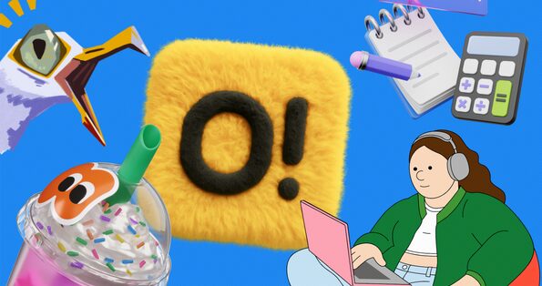
Midway through setup teammates will ask for a quick way to browse the catalog. Keep a clear pointer in your rules and mirror it here for easy access while you shortlist and build the kit: clipart.
Accessibility that ships
Illustrations help only when everyone can understand the page. Treat accessibility as a checklist that lives in pull requests.
Alt decisions
- informative image: write a short alt that communicates the same idea
- decorative image: use empty alt so assistive tech skips it
- inline SVG: include a concise title and, when helpful, a description
<svg role="img" aria-labelledby="t d" width="512" height="256">

  <title id="t">Team defining analytics goals</title>

  <desc id="d">Colleagues move charts and sticky notes while another checks results</desc>

</svg>
Contrast and state
If the artwork contains essential text or uses color to signal meaning, follow WCAG 2.2 ratios. Bind fills and strokes to the same tokens used by buttons and alerts so success and error read the same across art and UI. W3C WAI resources provide the decision trees for text alternatives and decorative images.
Representation
Choose inclusive characters and neutral activities. Avoid clichés. When in doubt, test scenes with a small panel that reflects your audience.
Performance that survives production
Images often dominate payload. Give them a number and enforce it.
- prefer SVG whenever texture is not essential
- export PNG only at the size you render
- always set width and height to prevent layout shift
- lazy load below the fold
- measure Largest Contentful Paint on the actual pages that will ship
Responsive raster without a framework:
<picture>

  <source type="image/avif" srcset="/hero-ouch.avif 1x, /hero-ouch@2x.avif 2x">

  <source type="image/webp" srcset="/hero-ouch.webp 1x, /hero-ouch@2x.webp 2x">

  <img src="/hero-ouch.png" srcset="/hero-ouch@2x.png 2x" alt="Colleagues reviewing analytics" width="1280" height="720" loading="eager">

</picture>

Inline SVG tied to theme variables:

<style>

  :root { --accent: #2563eb }

  @media (prefers-color-scheme: dark) { :root { --accent: #7c3aed } }

  .hero [data-accent] { fill: var(--accent) }

</style>

<svg class="hero" role="img" aria-labelledby="a b" width="480" height="240">

  <title id="a">Growth chart trending upward</title>

  <desc id="b">Line rising across a simple grid</desc>

  <path data-accent d="M10 200 L120 140 L220 160 L360 80" fill="none" stroke="var(--accent)" stroke-width="6"/>

</svg>
Role guides
Web and UX
Use imagery to clarify purpose. Empty states carry one action and a short line of copy. Onboarding reads cleanly as start, progress, success with the same cast. Convert SVGs into components in your design tool and map fills to color styles so a theme change does not require new exports. In tight spaces choose a small spot instead of a dense scene.
Marketing and SMM
Plan for speed. Build a social grid with square, vertical, and horizontal frames. Pre crop key scenes for those ratios and store the variants next to the brief. Keep one recurring character or prop across a campaign to improve recall. Email uses PNG with careful compression because client support still varies.
Developers
Version artwork in the repo. Keep assets near the component that renders them. Inline SVG lets you respond to theme toggles with CSS variables. Do not put heavy images on critical paths. If motion is required, animate vectors rather than shipping a large video.
Education
Ouch works in coursework and LMS material. Students learn hierarchy and rhythm by remixing scenes instead of starting from a blank page. Provide a style pack, a fixed palette, and three target screens. Store license receipts and attribution notes in the repo so portfolios remain compliant.
Startups and small businesses
Pick one style and freeze it for a quarter. Apply it to site, deck, store listing, and the top product screens. You get cohesion today. Commission custom scenes later for signature features.
Governance and metrics
Add a compact checklist to pull requests.
- alt text present when needed
- decorative images marked correctly
- dimensions set to avoid layout shift
- file size under the page budget
- LCP verified on the target page
Track outcomes that matter.
- share of payload from hero art before and after vector adoption where possible
- LCP trend on the main landing page after rollout
- number of review flags for inconsistent imagery across three sprints
- hours from brief to first approved mock for a campaign
Known limits
Some niche scenes require a composite from parts. Motion work belongs in your animation stack. Large catalogs slow teams without a simple decision rule. Write the rule and enforce it.
Licensing snapshot
Icons8 publishes clear license terms. Free plans usually require credit. Paid plans remove attribution and expand use. Read the current policy on the publisher site. Save receipts in your brand folder and record where each asset ships. When legal asks for proof the trail is ready.
Bottom line
Ouch gives you a small visual language that travels across product and marketing without slowing delivery. Adopt one style. Build a compact kit. Wire it to tokens. Keep accessibility and performance as gates in review. The result feels intentional on every surface.
References
- W3C WAI documentation for WCAG 2.2 on text alternatives and contrast
- MDN documentation for SVG accessibility and embedding
- Web.dev guides on responsive images and image performance
- NN Group research on visual communication and comprehension in UX
- Illustration guidance in Shopify Polaris and Google Material Design


